Introduction
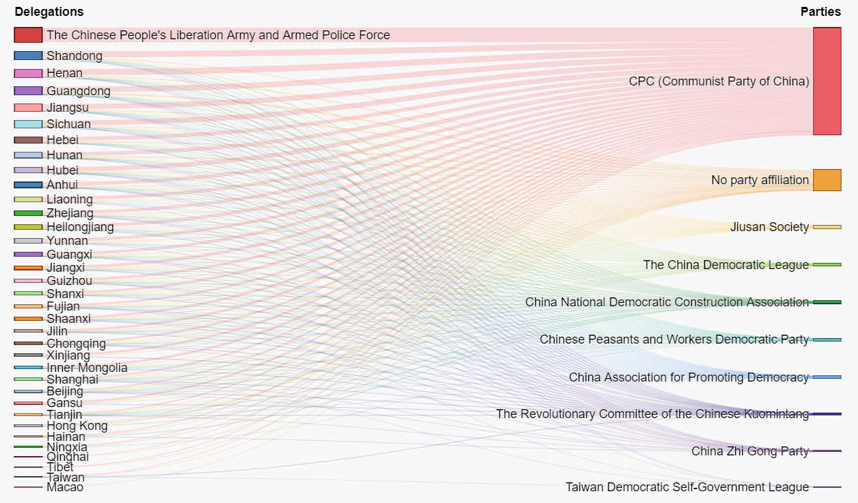
This chart is published by CGTN on March 4, 2019. The whole project is to present the demographic composition of National People's Congress, China's top legislature. The datas including the memeber's age, gender, ethnic group, educational background and so on. The chart above is to show their political groups. The left shows the delegations and the right shows the parties. Both for the delegations and the parties, the wider the line is, the more people they have.
Click here to see the original project by CGTN: who-runs-china
What is misleading
First of all, this sigle non-interactive chart carries too much information, which makes it difficult to understand simple and direct. The chart wants to show the numbers of people for each delegation and party, the political background for each delegatin and the delegation composition for each party at the same time. Then the whole chart becomes mess. Especially for the left part, it's very unclear that how many and what colors of the lines for each delegation.
Sencond thing is the color used. Red is so strong that it almost covers all other lines. It seem's that only lines and the area of red could be seen clearly in the chart. This gives people very strong impression that CPC has win the majority. Although it's true that more than 70% deputies are in CPC, but for other political parties, they also have deputies from many different delegations.
Advice
To improve this chart, I would suggest to make it interactive. When readers point or click on each partie or delegation, the lines from it can stand out and be highlighted. So that readers can get a clear idea of each group and not be disturbed by so many lines.